Introduction
For the past year I’ve been working back in the energy world, where my heart truly lies. As I said to my previous employer, “I don’t listen to podcasts about employment and staffing; I listen to podcasts about energy.”
Anyways, outside of the traditional data science work of data processing and modeling, I’ve been working with some formal statistical experimentation. One of the major areas where we see this kind of work is in measuring the effects of behavioral savings programs. The idea of a behavioral program is that you separate a group of utility customers into a treatment and a control group. The treatment group receives personalized messaging about their consuming energy and how they could potential alter their behavior to save energy. The control group is chosen to be as statistically similar as possible and they do not receive any messaging. The control group is there to just what it sounds like, control against all other factors. If Taylor Swift starts a nationwide energy efficiency campaign that has a positive effect across all consumers, the control group will capture something like this. Something more likely is that the control group will control for changes in energy consumption due to weather patterns. So the difference between the treatment and control groups at the end of the experiment represents the true effect of the behavioral program.
One of the essential parts of setting up a program like this is first measuring the statistical power of your experiment. This will tell you what amount of savings you could statistically be able to measure in a given program. Often these programs save small amounts of energy, on the order of 1-4% over a year. The power of these programs is that at the scale they operate, this can add up to significant savings for the utility.
But the question remains, how can I be sure that I can identify these small energy savings with statistical certainty?
Why Statistical Power Matters
I like to make my own pizza dough at home. I have a large kitchen scale that I use for measuring out the amount of flour that I need, typically on the order of 100s of grams. But this scale can’t measure at the granularity I need when measure out my yeast, which is on the order of 1-3 grams.
Now this is probably more accurately described as the “precision” of the scales; but I like to think about these scales in the context of statistical power as well. I need to make sure that before I run my experiment that I understand what “scale” I’m using to measure the energy savings and that it can accurate measure the changes I anticipate. Not having the proper statistical power when designing the experiment can make the whole program essentially useless as regulators and utilities require statistical significance to claim real, verifiable savings.
But what really is statistical power? Statistical power is the probability of detecting an effect (i.e. rejecting the null hypothesis) given that some prespecified effect actually exists using a given test in a given context. A Statistical power of 80% means that if the true effect exists, we’ll detect it 80% of the time. The other 20% would be ‘false negatives’ where the effect is real but our study missed it.
Approaches to Measuring Statistical Power
NREL’s Residential Behavioral Evaluation Protocol describes two methods for conducting a statistical power analysis:
- Simulation Based
- Analytic Formulas
The simulation based requires that historical consumption data of the study population be available. The benefits of this method is that it can essentially mimic the actual methodology for the end savings estimation of the program. Additionally with something as irregular as home energy consumption—with its seasonal swings, weather sensitivity, and household-to-household variation—the simulation method tends to be more reliable.
Analytic methods also exist and many statistical software applications like R, STATA, and SAS include packages for doing such work.
In this post we’ll walk through an example of the simulation based approach.
Measuring Statistical Power with Simulations
I’ve implemented the NREL methodology in Python. Below I’ll walk through the key steps conceptually, with references to the code. The full notebook is available here if you want to run it yourself or adapt it for your own analysis.
Methodology
NREL’s simulation methodology is as follows:
Simulation follows these steps:
- Researchers should divide the pretreatment sample period into two parts, corresponding to a simulation pretreatment and post-treatment period. For example, an evaluator with monthly billing consumption data for 24 pretreatment months could divide the pretreatment period into months 1 to 12 and months 13 to 24 and designate the first 12 months as the simulation pretreatment period.
- From the eligible program population, researchers should randomly assign NT subjects to the treatment group and NC subjects to the control group.
- Researchers should decide upon the minimum detectable treatment effect (for example, 2 kWh/period/subject), and a distribution of treatment effects (for example, normal distribution with mean 2 and standard deviation 1). For each treatment customer, the researcher should simulate the program treatment effect, taken randomly from the distribution of treatment effects, during the simulation treatment period. (One could also assume the treatment effect is the same for all customers and merely apply the same effect to all households; however, the power calculation is likely to underestimate the number of households needed because it assumes zero variance for the treatment effect).
- Researchers should randomly sample with replacement NT customers from the treatment group and NC subjects from the control group.
- Researchers should estimate the program treatment effect for the sample only using data from the simulation pretreatment and simulation post-treatment periods and record the estimate and whether the estimate was statistically significant for a given Type 1 error.
- Researchers should repeat steps 4 and 5 many times (for example, >250), and calculate the percentage of iterations when the estimated treatment effect was statistically different than zero. This is the statistical power of the study, the probability of detecting savings of x with treatment group size NT and control group size NC.
Obtaining some data
For this example, we’ll use data generated by NREL’s ResStock program in their End-Use Load Profiles dataset. As a part of their program they make available a large number of energy simulations of residential homes across the country. We’ll start with pulling about 2000 simulations.
The following “spaghetti plot” shows a sample of normalized consumption patterns in this group:
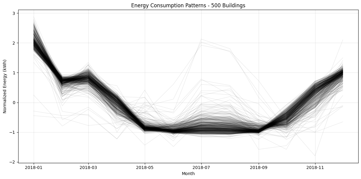
You can see the clear seasonal pattern with higher consumption in winter months, but also substantial variation between buildings.
Creating Synthetic Year 2 data
The NREL ResStock simulations provide a single years worth of data. As a part of our statistical savings estimations, we’ll be utilizing a Difference-in-Difference method so we’ll need an additional year of data. In order to create this following year of data, we’ll add some noise to the original data set in a couple ways:
- Add a random annual scaling factor between 0.95 and 1.05
- Add a random month by month scaling factor between 0.92 and 1.08
Here’s a sample building with it’s original 2018 data and then it’s synthetic 2019 data with the noise added in:
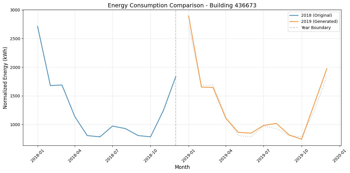
The blue line represents the 2018 simulation, and the orange line represents our synthetic year. The dotted gray line shows where the 2018 data would fall if carried forward unchanged.
The Simulation Method
Now it’s time to prepare the simulation.
First, we assign all of our data to either the pre-treatment period or the treatment period. In our example, the pre-treatment period is the original 2018 simulation data and the treatment period will be the synthetic 2019 data. In the notebook this work is done with the function called prepare_simulation_data() .
Next, we randomly assign treatment and control groups. As a part of this experiment we’ll be using varying size of control groups to see how much statistical power we achieve with each size. In the notebook this work is done with the function called assign_groups() .
Then, we apply a known amount of “effect” to treatment group. This effect will be our minimum detectable effect. If for example we want to know the statistical power of being able to measure a 2% effect in the population, this function will apply that effect to the treatment group. Importantly, this effect will not be applied evenly across the treatment group. Just like in a real program, some households respond more than others. On aggregate, however, the entire treatment group will have the minimum detectable effect applied. In the notebook this work is done with the function called apply_mde() .
Finally, we estimate the treatment effect using a Panel OLS Difference-in-Differences (Did) regression. DiD controls for pre-existing differences between groups and any shared trends over time—making it the standard approach for these evaluations. (This may be a future blog post) From this regression we’ll collect the effect and a p-value. In the notebook this work is done with the function called run_regression() .
For each of the configurations of varying minimum detectable effects and control group sizes we will run 500 regressions. Each of these runs involve re-randomizing the group assignments. The amount of times that we discover the applied effect with statistical significance divided by the total number of regressions gives us our statistical power.
Results: The Power Curve
In our example here we started with a treatment group of 1,000 buildings. We then added control groups of sizes: 100, 200, 400, 600, 800, and 1000. The minimum detectable effect values that we used were: 0.5%, 1%, 1.5% and 2%
We can plot the statistical power of each simulation run against the control group percentage for each of the minimum detectable effect values which give us the power curve:
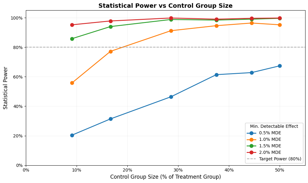
As you can see, and as is expected, we get increased statistical power as the size our control group increases. The red dotted line represent a statistical power of 80%, which is a common threshold of statistical power when designing these studies. Additionally we can see that an increase in the minimum detectable effect will increase our statistical power.
In our example here, we can achieve a statistical power greater than 80% with a control group size of 200 if we’re trying to measure a 1.5% effect. We can also see that with our current population size we cannot expect to be able to measure a 0.5% effect over the population even with the full 1000 available control group subjects.
Takeaways
One of the biggest takeaways for me is the importance of running the power analysis as a part of experiment design. Just because your analysis spits out a number doesn’t mean that number is meaningful. This is especially important in the context of behavioral energy programs which are expensive and time consuming to run. Do the work in the experimental design phase to put your program in the best position to achieve savings.
Secondarily, I think there are many benefits to the simulation based method for a power analysis. Not only does it simulate the analysis of messy real-world data like home energy consumption, it also sets you up to run the final energy savings calculations at the conclusion of the program.
Conclusion
I hope this explanation of statistical power and the accompanying examples are useful for other practitioners in the space. I certainly learned a lot about this concept while preparing this material and look forward to sharing more in the future!